


Nicely done, non technical, but considerable and basic and step by step guide to data analysis. Gives lots of suggestions to be complete about the process. From Geckoboard, a company that has a dashboard product.
A Guide to Basic Data Analysis
Trying to find the cause of a problem in your business? Data can help, but sometimes knowing how to explore and interpret it can be intimidating. We've put together this no nonsense data analysis guide to walk you through a simple process so you can confidently use data to find answers and make smart decisions. .... "
Showing posts with label dashboard. Show all posts
Showing posts with label dashboard. Show all posts
Sunday, March 25, 2018

Wednesday, June 07, 2017
Building Dashboards with Story and Flow
Nicely done 12 page pdf from Tableau on building Dashboards.
... Making Flow Happen:
How to Build Dashboards That Persuade, Inform and Engage
In data visualization, flow is crucial. Your audience should smoothly absorb and use the information in a dashboard without distractions or turbulence. Lack of flow means lack of communication, which means failure.
Psychologist Mihaly Czikszentmihalyi has studied flow extensively. Czikszentmihalyi and other researchers have found that flow is correlated with happiness, creativity, and productivity. People experience flow when their skills are engaged and they’re being challenged just the right amount. The experience is not too challenging or too easy: flow is a just-right, Goldilocks state of being.
So how do you create flow for an audience? By tailoring the presentation of data to that audience. If you focus on the skills, motivations, and needs of an audience, you’ll have a better chance of creating a positive experience of flow with your dashboards. And by creating that flow, you’ll be able to persuade, inform, and engage. ... "
... Making Flow Happen:
How to Build Dashboards That Persuade, Inform and Engage
In data visualization, flow is crucial. Your audience should smoothly absorb and use the information in a dashboard without distractions or turbulence. Lack of flow means lack of communication, which means failure.
Psychologist Mihaly Czikszentmihalyi has studied flow extensively. Czikszentmihalyi and other researchers have found that flow is correlated with happiness, creativity, and productivity. People experience flow when their skills are engaged and they’re being challenged just the right amount. The experience is not too challenging or too easy: flow is a just-right, Goldilocks state of being.
So how do you create flow for an audience? By tailoring the presentation of data to that audience. If you focus on the skills, motivations, and needs of an audience, you’ll have a better chance of creating a positive experience of flow with your dashboards. And by creating that flow, you’ll be able to persuade, inform, and engage. ... "
Wednesday, May 24, 2017
A Big Book of Dashboards
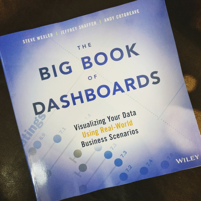 Brought to my attention. I have heard this praised. One of the authors, Jeffrey Shaffer, spoke at our analytics summit last week.
The Big Book of Dashboards presents a comprehensive reference for those tasked with building or overseeing the development of business dashboards. ...
Comprising dozens of examples that address different industries and departments (healthcare, transportation, finance, human resources, marketing, customer service, sports, etc.) and different platforms (print, desktop, tablet, smartphone, and conference room display) The Big Book of Dashboards is the only book that matches great dashboards with real-world business scenarios. ... "
#BBOD @UCAnalytics17
Friday, October 28, 2016
Open Source Dashboards to Organize Data
Check out Astronomer (not related to the physical science)
SIX OPEN SOURCE DASHBOARDS TO ORGANIZE YOUR DATA
Astronomer believes that every organization can benefit from having their data properly centralized, organized and cleaned. We’re building a platform to do just that.
For most businesses requiring flexible and powerful BI, Tableau is the first word that comes to mind. If you know what KPI's you want to track and don’t have the budget for a traditional enterprise dashboard, there are a number of open-source options with greater flexibility and affordability that we’re really excited about.
Check out our blog post by Ben, Astronomer's Head of Delivery, discussing some powerful open source dashboards for your data. ... "
SIX OPEN SOURCE DASHBOARDS TO ORGANIZE YOUR DATA
Astronomer believes that every organization can benefit from having their data properly centralized, organized and cleaned. We’re building a platform to do just that.
For most businesses requiring flexible and powerful BI, Tableau is the first word that comes to mind. If you know what KPI's you want to track and don’t have the budget for a traditional enterprise dashboard, there are a number of open-source options with greater flexibility and affordability that we’re really excited about.
Check out our blog post by Ben, Astronomer's Head of Delivery, discussing some powerful open source dashboards for your data. ... "
Friday, January 22, 2016
Watson Analytics Short Demo
Short, good, demonstration via Holly Nielsen of IBM:
2 Minute Dashboard With Watson Analytics
Watch Francis Hall take some typical sales pipeline data from a spreadsheet, and create a compelling, interactive dashboard in under 2 minutes: .... "
2 Minute Dashboard With Watson Analytics
Watch Francis Hall take some typical sales pipeline data from a spreadsheet, and create a compelling, interactive dashboard in under 2 minutes: .... "
Wednesday, January 23, 2013
Emailed Dashboards
David Hecht via Teradata's Gib Bassett. On a school of management based on emailed dashboards. Lately there has been This article suggests a simple method of getting data important that is to you. And while dashboards have become passe of late, this is a good example of simple is better. Sure you might commission a highly interactive visual data system like Procter & Gamble's Business sphere, that approach will not be cheap. Start with the important things periodically dropped in your inbox.
Wednesday, October 24, 2012
Dash Boards and all that
Interestingly thoughts by Stephen Few. On the use of dash board displays for control. Dashboards are just simple displays. Like the article says, at best an illusion of control. He uses a term I have never heard before which is telling: 'idiot lights'.
Tuesday, September 11, 2012
P&G Decision Cockpit Detailed
P&G's CIO Filippo Passerini provides some detail about P&G's long in development Decision Cockpit, the brains behind the Business Sphere information delivery approach mentioned here previously. " ... Sometimes you have to put the cart before the horse, according to Filippo Passerini, Procter & Gamble's Business Services Group President and CIO. That's how the consumer products giant came up with a decision-support environment now used by more than 60,000 employees worldwide to see what's happening in the business, why it's happening, and how to respond to changing market conditions. ... At the IW500 Conference, P&G's Filippo Passerini demos analytic dashboards used to forecast performance and drive the right decisions.... "
Tuesday, December 13, 2011
The Intelligent Social Dashboard
Addresses the sharepocalypse. I am confused, both before and after the private introduction of 'Bottlenose', but it may be worth examination:
" It's hard enough being a normal user, but some have millions of people tweeting at them! How are they supposed to process all those messages? In the Information Age, you'd think more data would be a good thing, but on the social Web, the opposite is true. But the aforementioned Nova Spivack - along with co-founder Dominiek ter Heide - has just unveiled Bottlenose, and it could be the tool that helps us avert The Sharepocalypse in the nick of time.... "
" It's hard enough being a normal user, but some have millions of people tweeting at them! How are they supposed to process all those messages? In the Information Age, you'd think more data would be a good thing, but on the social Web, the opposite is true. But the aforementioned Nova Spivack - along with co-founder Dominiek ter Heide - has just unveiled Bottlenose, and it could be the tool that helps us avert The Sharepocalypse in the nick of time.... "
Wednesday, September 08, 2010
Dashboard Solutions: Gartner Research
Via IBM/Cognos. Registration required, access here. Despite some of the criticism of the format, I think that the use of dashboard as a modular component of business intelligence is a very useful approach. Especially if there is the added complexity of interactive access.
" ... A Gartner paper for good practices and common traps to avoid when you build dashboards.
Think BIG. Start Small.
Drive Better Decisions with Better Dashboard Solutions
According to this research from Gartner: "A good maxim is to keep dashboards simple— this approach is much more likely to be useful in helping you build dashboards that are fit for purpose." ... "
" ... A Gartner paper for good practices and common traps to avoid when you build dashboards.
Think BIG. Start Small.
Drive Better Decisions with Better Dashboard Solutions
According to this research from Gartner: "A good maxim is to keep dashboards simple— this approach is much more likely to be useful in helping you build dashboards that are fit for purpose." ... "
Subscribe to:
Posts (Atom)